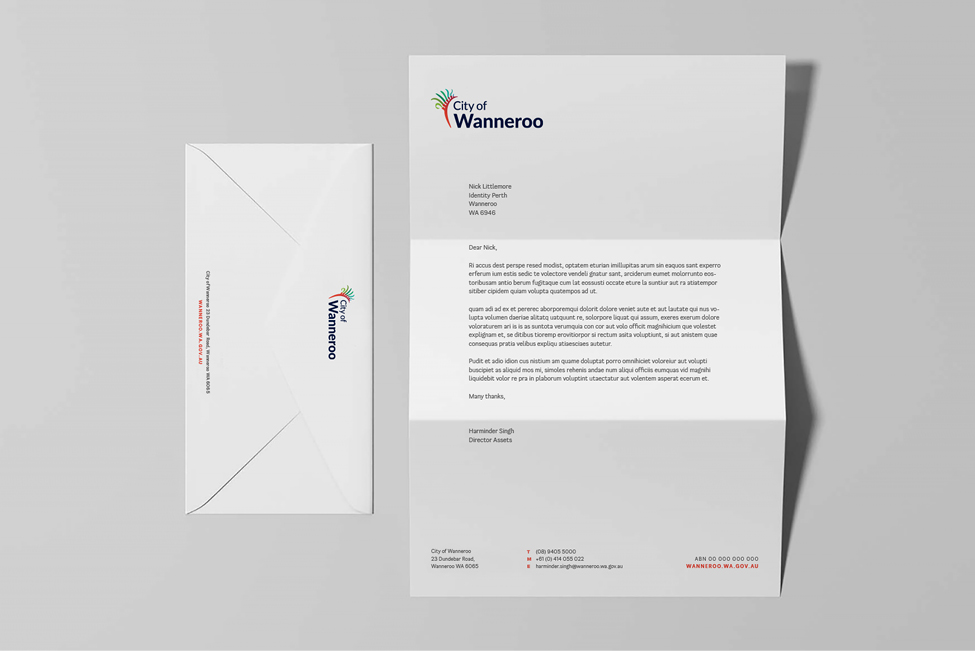
Brand identity Copywriting Naming Motion Tone of voice
Embarking on a transformative journey, our creative agency has eagerly accepted the challenge to redefine the identity of the City of Wanneroo. The objective is clear – breathe new life into a city rich with history, diversity, and community spirit. Our mission is to encapsulate these elements in a fresh, cohesive brand that resonates with residents and captures the attention of the broader public.
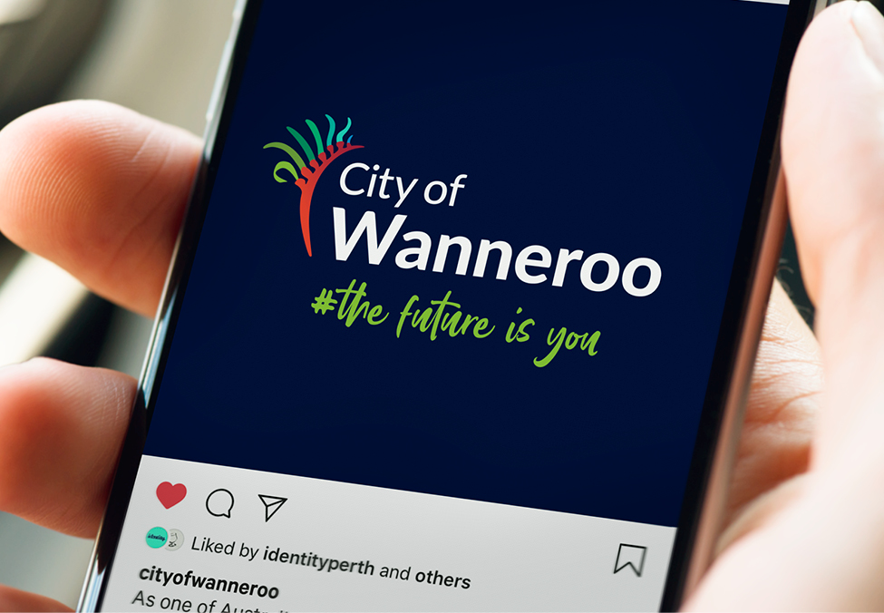
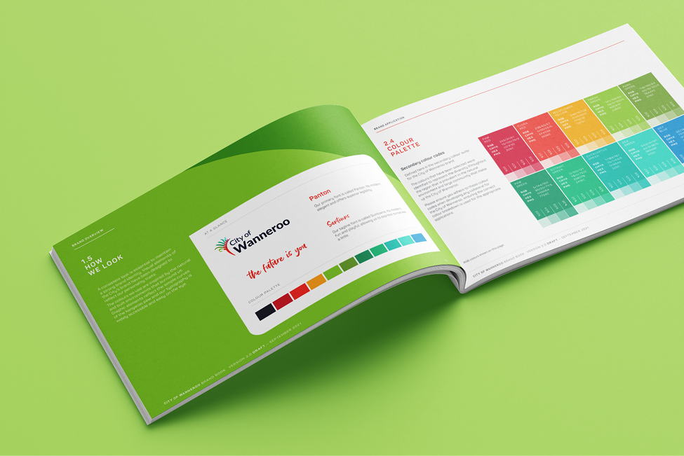
At the heart of the rebranding effort is the iconic Kangaroo Paw flower, a symbol deeply rooted in the city’s identity. Our approach to modernizing the original logo silhouette was a delicate balance between honoring tradition and embracing progress. The Kangaroo Paw, with its distinctive shape and intricate details, now takes on a sleek and contemporary form. Streamlined lines and a cleaner silhouette bring a sense of modernity, while retaining the essence of the flower’s unique beauty.
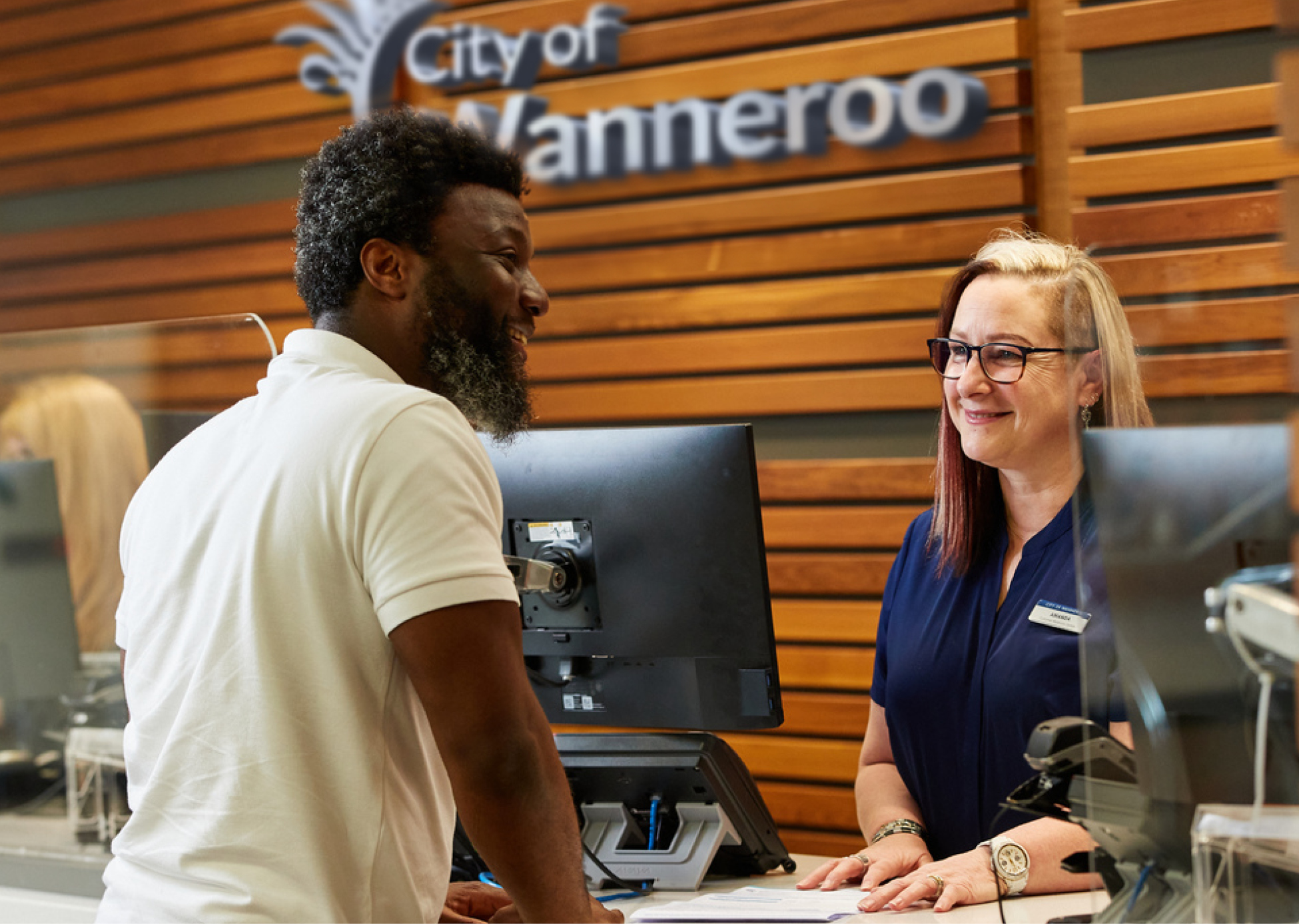
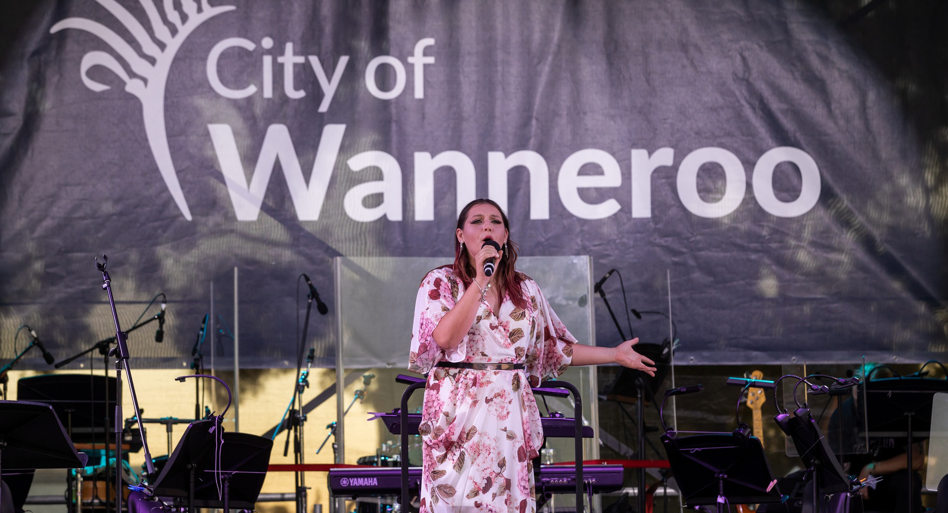
As a creative agency, it has been our privilege to be entrusted with the rebranding of the City of Wanneroo. Our journey is not just about creating a new identity; it’s about shaping a narrative that resonates with the heart and soul of this vibrant community. Together, we’re transforming Wanneroo into more than just a place – it’s becoming a symbol of unity, pride, and forward momentum.