Brand identity Copywriting Naming Motion Tone of voice
Sterling Property, formerly operating under the LJ Hooker brand, is a leading commercial real estate agency specializing in premium commercial projects. Seeking a brand overhaul to better align with its commitment to excellence and innovation, Sterling Property initiated a comprehensive rebranding and design project.
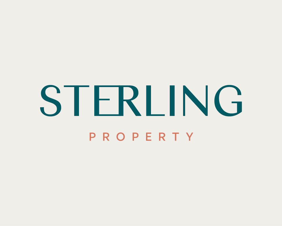
The rebranding effort began with a strategic naming approach, resulting in the selection of “Sterling Property” to convey a sense of quality and sophistication. The visual identity transformation included a refined logo featuring clean lines, elegant typography, and a sophisticated color palette. The integration of deep green and metallic silver aimed to embody excellence and timelessness. This visual language was seamlessly extended across stationery, digital platforms, marketing materials, and physical spaces, ensuring a consistent and elevated brand experience.
The Sterling Property rebranding project successfully positioned the company as a distinguished player in the real estate industry. The cohesive branding strategy, encompassing the business name and collateral design, effectively communicates a commitment to premium property experiences and modern design. This strategic rebrand not only differentiates Sterling Property in a competitive market but also attracts a discerning clientele seeking the epitome of quality in commercial real estate. The brand stands as a compelling example of the transformative power of strategic rebranding in enhancing a company’s image and market position.